Official Colors Palette
Color Palette
Deliberate, consistent use of color that holds true meaning, inspired by the iconic visuals that represent Kennesaw State creates a powerful connection to the brand across all communication touchpoints. To use this approved color palette to guide your designs and layouts, download the color charts for print and digital via the Brand Center. The color composition of a piece should consist of Legacy Black and Hooty Hoo Gold as the primary colors. Complementary colors should be used mostly for graphic and/or text accents. Flexibility is provided based on the composition of the piece, including the imagery. Pantone 1235 is the Gold recommended for color matching of materials used in merchandise such as fabrics, plastics or metal and the printing of gold on these items. It is important to understand whether the gold will be applied directly to plastic/metal or to a paper-based substrate that will be applied to the plastic or metal. Pantone 123C may work best for printing on coated paper. Always require physical proofs to check color matching to the brand color spec sheets. If you do not have color spec sheets contact Brand Support. The use of Kennesaw State branding on merchandise is managed by the Office of Trademark Management & Licensing.
PRIMARY PALETTE Legacy Black and Hooty Hoo Gold should be the main colors for Kennesaw State communications because it easily connects back to our primary identity. Only use tints of the brand colors in illustrated elements.
Complementary Colors
The use of our primary and complementary color palette will be a consistent part of
our
branding. Complementary colors are to be used as accents and added to the primary
color palette.
Never use complementary colors as primaries; the complementary colors were developed to complement our primary colors not to overtake them. The use of colors other than our official primary colors is acceptable but they must be used complimentary or accents to our primary colors and must use the 10-20% usage guideline. Promotional campaigns should adhere to the 10-20% complementary guideline.
Other colors can be used for event marketing or promotion, but the alternate color must have a direct meaning or connection to the promotion or event (i.e. pink = breast cancer awareness). If applying the logo on any complementary or alternate color the university logo should be applied in all white.
Vibrant Cool Colors
Our vibrant hues bring liveliness and diversity to the overall KSU brand.
Vibrant Warm Colors
Neutral
Our neutral hues add balance and warmth, providing a subtle backdrop for the other colors.
Master Brand Background Color Usage
Full-color Master Brand
Correct application of the university brand logos greatly depends on the background colors. A key guideline in the application is the interior of the KS monogram must be lighter than the first outer stroke. Please see below examples of application of the brand.
Full-color application of the brand is recommended. Versions of black and white lettering are available for background color application of the brand. Full-color printing is required of the brand, if full color is used in the overall design. If printing on alternate color backgrounds, other than black, gold, grey, or white, the brand must appear in one color, all black or all white depending on background color. Some full color applications of the brand on alternate colors will be evaluated on a case-by-case basis.
Full-color black letters
Full-color white letters
Two-Color Master Brand
Two-color versions are available but can only be applied when a light or soft color background is used. Dark backgrounds such as black require full color or white one-color application.
Two-color version
Master Brand, black one-color
One-color logos are available for use, in both black and white options. The all black one-color option must be used on light or soft color backgrounds. The interior of the KS monogram must be lighter than the first outer stroke. If printing on alternate color backgrounds, other than black, gold, grey, or white, the brand must appear in one color, all white.
One-color all black
Master brand, white one-color
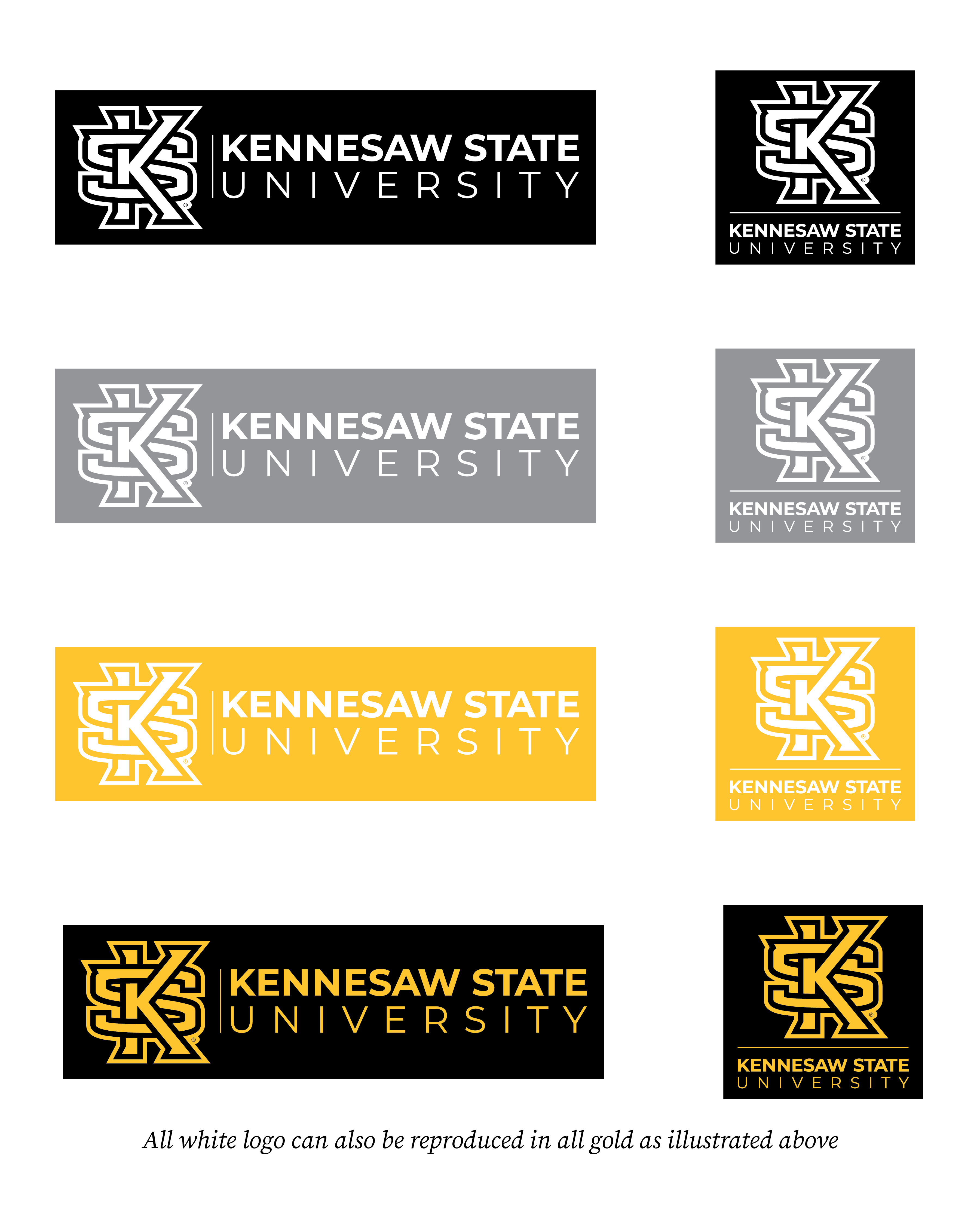
One-color logos are available for use, in both black and white options. The all white one-color option must be used on darker colored back grounds. The interior of the KS monogram must be lighter than the first outer stroke. If printing on alternate color backgrounds, other than black, gold, grey, or white, the brand must appear in one color all white.
One-color all white


